GAME ON
bar+arcade
Rebrand a local establishment by creating assets such as letterheads, ads, webpages and more! University project
Project Overview

Rebrand for the gaming bar, Game On
-
Brand:
-
A gathering place where people can come together, enjoy classic games, and sip on cold drinks. Striving to foster a sense of community and bring out the inner kid in all of its guests.
-
-
Deliverables:
-
Brand Identity - Logo, Letterhead, Business Card, Envelope
-
Ads - Social Media Posts/Story, Banner Ad, Billboard
-
Website - Home Page, 3 extra pages
-
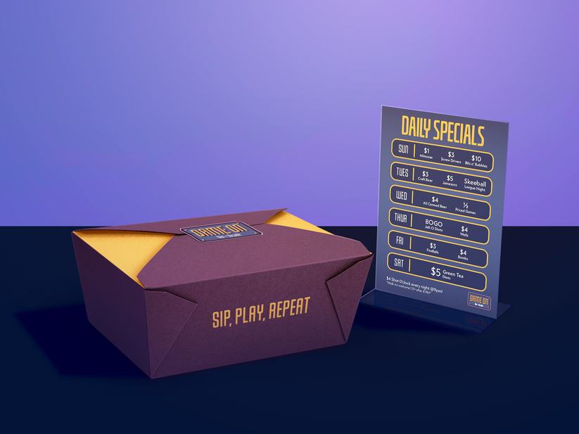
Misc - Take-out Box, Table-top Special Deals
-
Brand Identity
The new Game On logo is inspired by '80s and '90s video game title screens, such as "Super Mario Bros." and "Tapper". This inspiration is expressed via the typography of the logo, "Bar + Arcade", which resembes the 'Press Start' when starting an arcade game. A customized version of 'Baucher Gothic URW Extd - BOLD' is used for the logo.
Advertisements
.png)
.png)
As part of the digital ads, I created a social media post (1:1), a Story post (9:16), and a YouTube Banner ad (728 x 90px). I used AI software to brainstorm different call to actions and combined the best ideas. Too call back to the Arcade origins of Game On Bar+Arcade, I used neon highlights in each advertisement for cohesion. The bright-warm yellow was used to lead the viewer's eyes to key information.

%20v2.png)
Physical Ads were also created with a similar aesthetic to the digital ads. The billboard was created using standard specifications (14 x 48 ft). The half-page print ad was created using Game Informer Magazine's sizing (10.63in x 7.87in PAGE | 5.315in x 7.87in AD).
Website
Game On's website was re-designed from the ground up using the new branding I created. I used a square grid for its easy modularity. If more buttons are required to be added over time, it is simple to add it into the grid. Scrolling down the website shows the contents of the website menu items.
Yellow was used to highlight and lead the viewers eyes to relevant information. 'Baucher Gothic Extd' was used for the headers while 'Neue Kabel Regular' was used for the body type for easy legibility.
%20-%20Normal.png)


