%20-%20Normal.png)

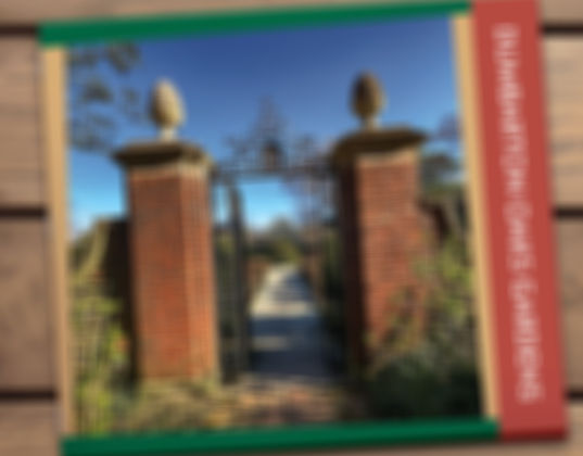
Dumbardon Oaks Gardens
Brochure & Photography
As part of a University Project, I was tasked to design a 10-page brochure of the Dumbarton Oaks Park. No stock images, assets, and text were allowed to be used. The target audience is College-ages adults with limited monetary resources.
Brochure Design
.jpg)
.jpg)
As the target audience for this project was Generation Z, I chose to include bright, vibrant colors along with dynamic-bold shapes to keep each page interesting to look at. Each of the colors used alude to the variety of greenery and architecture found in the gardens.
Layout
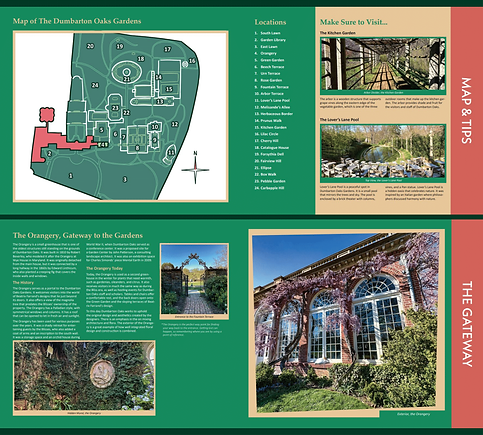

A 3 column was used for easy legibility. But in order for the column design to not feel same-y between pages, sections are separated by color, giving the allusion of switching between a 3 and 2 column grid. The 3 colors (forest green, brick red, and soft yellow) were chosen not only for their reference to the colors found within the garden, but also for their ability to easily co-exist next to each other, and to be able to overlap while keeping optimal legibility.